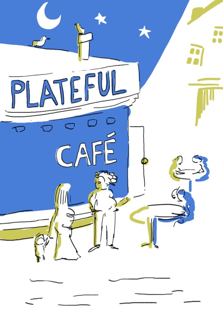
The idea behind Plateful Cafe is simple. We employ refugees with a talent for cooking and they use their skills to share amazing food with the local community. People who could otherwise wait years to enter the UK workforce find meaningful work more quickly, and Londoners benefit from the amazing culture they bring with them.
But as much as the idea is straightforward, putting it across visually is not so much. We wanted to show that Plateful Cafe is the place to come for vibrant, healthy food and that doing so will benefit the community. The design also needed to work across the organisation, from the cafe itself to our catering and our market stalls. That’s a hefty brief.
So, we kept it simple. We focused on three core parts of our mission and grew the design from there.

As obvious as it sounds, the plate is central to everything we do. A full plate means you’re fulfilled, safe, and not wanting. It also implies arrival, togetherness, and the ability to provide to others. Our plate is one of variety, filled with food from many sources and cultures.
We were inspired by an Arabic design to form the border of our logo. This design will show up all across our brand, from jam labels to banners.

But Plateful Cafe isn’t like other cafes – there’s a lot more to it than the tableware, which provides things for people to consume. Somehow, we needed to show that this food is connected with refugees. That it has a social impact. And that it is a warm place of welcome.
How better to show this than with a heart? One that isn’t cutesy or kitsch but that unashamedly sits at the core of everything we do. Just like the cafe itself is refugee-led, the logo revolves around the heart at its centre.
A plate and a heart go some way to describing our charity, but they miss one crucial thing – our cooking.
This was the most difficult part of the design. Should we focus on the process of preparation, with utensils showing the expertise of our chefs? Or should we focus on the chefs themselves, with a chef’s hat? We tried both options, but they weren’t quite right.

In the end, we decided that it’s the food itself that helps our chefs connect with the community and vice versa.
The humble beetroot shows that we’re a family kitchen, not something manufactured or artificial. Our food is healthy, handmade, and unique. And the cafe itself helps refugees in south London put down roots and flourish in their new environment.

Our first design went through a couple of mutations before we were happy with it. We took inspiration from our very own pickled beetroot for the colour palate, and got help creating a custom font for the typography. But the core elements were there to stay – a full plate, a kind heart, and quality, fresh food that helps the community grow.