Why Plateful Cafe?
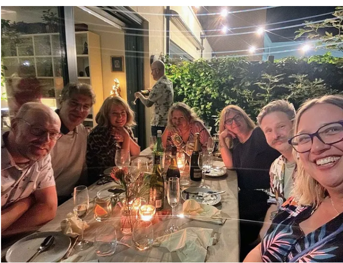
What is Plateful Cafe? Firstly, let’s establish what is Plateful Café? Plateful Café is a social enterprise that connects refugees and local people through a shared love of good food. Our primary objective at Plateful is to establish a physical café where we can serve food lovingly created by our Refugee Chefs. There were a couple of motivations at hand when we decided to set up Plateful Café. First let’s start with the obvious – fantastic food, food is as close as we really get to a universal shared language. In the absence of a common language, food is such an interesting insight into another culture: from the extraordinary precision of sushi to the shared eating experience of Injera, a food popular in Ethiopia. We wanted Plateful to be an insight into the lives and stories of the Refugee chefs who lovingly create the dishes. Whilst much of life is sadly left behind when you are forced to flee your home, knowledge and recipes remain. In this way, food for many of us is so much more than just what’s on your plate. Secondly, the unfortunate reality is that in many charities that involve refugees creating and selling their products, the refugees themselves are detached, or at worst removed, from important decisions and directions the charity takes. At Plateful we are committed to ensuring that every decision we make not only puts the interests of Refugees first but, crucially, is made with Refugees. Finally, we wanted the café and our events leading up to its formation to be a springboard for greater social and cultural cohesion. Today, more than ever, we seem to live in echo chambers. We socialise with the same people, see the same views on LinkedIn, go to the same restaurants. Plateful Café aims to be an antidote to that by creating a space where people from different backgrounds can come together, regardless of social status or background, to share a love of good food. The pay-what-you-can pricing system and the location of the café in a community-owned pub are designed to encourage this kind of interaction. Our Valentine’s Day Dinner on the 15th of February officially marks the start of our journey and it is exciting. We know the journey will most certainly not be a smooth one, but we’ve got a fantastic (growing!) team and we’re all united by a common goal: spreading world flavours by refugee chefs. If you are free, we’d love for you to join us for our dinner later this month: not only to try delicious food but to meet a community of like minded people, all committed to making our society just that bit of a nicer place to be. We hope to see you there.


